Monday, December 13, 2010

Charles Rennie Mackintosh


NOTES
A Scottish architect, designer and a watercolorist
A designer in the Arts and Crafts movement
He was the main exponent of Art Nouveau in Scotland.
HIS STYLE
Mixed elements of Scottish vernacular and the English Arts and Crafts tradition with the organic forms of Art Nouveau
a contrast between strong right angles and floral-inspired decorative motifs with subtle curves
Drive to be modern
As his work matured, he employed bolder geometric forms in place of organic-inspired symbolic decoration

CHARLES RENNIE MACKINTOSH WORK CAN BE DIVIDED INTO 3 MAIN AREAS:
vpublic buildings
vprivate homes
vtea rooms
THE GLASGOW SCHOOL OF ARTS
1884 - he began a five-year pupilage with the Glasgow architects John Hutchins.
1889 - he joined the more eminent firm of Honeyman & Keppie.
1890s - was a decade of learning and development.
1894 - Develops designs with MacNair and The Macdonald Sisters. Together they are known as “The Four”
1900 - Miss Cranston commissions him to design the interior and furniture for The Ladies’ Luncheon Room, Ingram Street tearooms
1903 - Miss Cranston commissions Mackintosh to design the exterior and interiors of The Willow tea rooms, Glasgow.
1909 - Designs the Card Room for Hous’hill as well as the Oval Room and ladies’ rest room at the Ingram Street tea rooms. Opening of the west wing of Glasgow School of Art
1911 - Creates the interiors of The Cloister Room and Chinese Room for the Ingram Street tea rooms, Glasgow
1928 - Dies in London of cancer of the tongue

THE ARTS AND CRAFTS MOVEMENT
Is a British and American aesthetic movement that aimed to promote a return to hand-craftsmanship and to assert the creative independence of individual craftspeople.
It was a reaction against the industrialized society that had boomed in Britain in the Victorian period, and aimed for social as well as artistic reform.
Its example was followed in other countries, particularly the U.S.A. After the 1914-18 war, other artistic trends overtook the ACM, and it declined.


2nd part, philippe starck (tonton)


more photos from tonton's report....


Philippe Starck


Some websites to read further on Philippe Starck

http://www.starck.com/
http://en.wikipedia.org/wiki/Philippe_Starck
http://www.ted.com/talks/philippe_starck_thinks_deep_on_design.html


Tuesday, November 30, 2010

PART 2, LINES


LINES IN SPACE

Lines have many uses in design. They can be used as the axes of solid forms. To describe planes or volumes and to delineate.

There are 3 main tyes of lines directional curves, slow curves and fast curves. Pls. see images below to see the different categories and types of lines.


Monday, November 22, 2010

cebu hardware

Contact details of Cebu hardware. I cant find a map but hope this would help.

#335 Manalili Street, Cebu City, 6000, Philippines
Cebu, Region 7

t: (63-32) 253-3548
f: (63-32) 253-1422

Monday, August 9, 2010

DESIGN SPEAK: CAPTURING DESIGN

Listen to and watch the film expert

unviel how she captures design

in a film documentary!

DESIGN SPEAK: CAPTURING DESIGN

An Agnes B Cardigan Film Documentary

by JOANNA ARONG

19 August 2010, Thursday, 6:30 pm

Chiye Mori Design Library

Suite 204 Rivergate Commercial Complex

Gen. Maxilom Ave., Cebu City


Seats are limited.

For confirmation, kindly reply to this email

or call CDEF at 255.2341 for seat reservation.

Monday, July 19, 2010

technical drawings


Just some images of atechnicaldrawing. Technical drawings are really meant to help us in visualizing a product. . Pls. check out these links for further readings :

http://en.wikipedia.org/wiki/Technical_drawing
http://www.scribd.com/doc/8455804/Technical-Drawing

Thursday, July 15, 2010

Minimalist house


Minimalist house by Japanese studio
Shinichi Ogawa & Associates in Okinawa, Japan. the house is divided length ways in to a courtyard and living spaces.

Pls. check out photos and further information in http://www.dezeen.com/2010/07/14/minimalist-house-by-shinichi-ogawa-associates/#more-87101 .

Wednesday, July 14, 2010

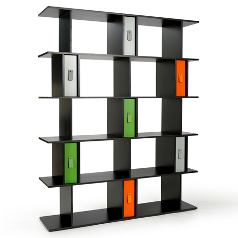
rectilinear volumes - bookshelf

Foundation by Benjamin Hubert

This bookshelf by Benjamin Hubert is based on rectilinear volumes. For more information http://www.benjaminhubert.co.uk/


Monday, July 12, 2010

design sponge


Pls. check out this web site http://www.designspongeonline.com/


Friday, July 9, 2010

Die Drei by Martha Schwindling


These tables are made by design student Martha Schwindling. The three tables with drawers twist or tilt open. I posted the photo because of the usage of rectilinear volumes to create furniture to learn more about it . Pls. check out http://www.dezeen.com/category/furniture/page/2/

Thursday, July 8, 2010

Rectilinear Volumes, part 3


The following notes are from a book called
Elements of Design: Rowena Reed Kostellow and the Structure of Visual Relationships. I have copied some pages purely for educational purposes.

cont...

In Summary ........

The challenge here is to create unity from forms as essentially different in character as possible. Start by designing the dominant, then the sub dominant. Spend a little time on this relationship. Quickly complete the sub dominant element, and arrange in as three dimensional grouping as possible. This will give you a sense of the overall configuration. then you can begin to refine. Emphasize either the vertical or horizontal proportion in each sketch. All joining should be established. the design should look interesting and three dimensional from every position. It should achieve an effect of unity in which every part relates to every other part, and every design relationship contributes to the whole.

Unity is the visual glue that holds everything together. you know that you have achieved it when all the visual relationships within the design are organized in such an exquisite dependent relationship that every element supports and strengthens every other form and any minor change would upset the perfect balance and tension.

Take your best sketch and develop it in plaster. You may want to make your plaster sketch larger than your clay piece-perhaps one and a half or two times larger. Differences in proportion will become more apparent as you enlarge the design.

Enlarging isn't simply a matter of copying it requires you to pay attention to subtle changes in order to achieve a harmonious whole.


Rectilinear Volumes, part 2

The following notes are from a book called Elements of Design: Rowena Reed Kostellow and the Structure of Visual Relationships. I have copied some pages purely for educational purposes.


It is important to vary the proportions in your design. Make it interesting. the last thing you want is a predictable sequence of forms that look like " going going gone." The difference between beautiful and ordinary form is the sensitivity of these proportions. It is intangible but very real quality. Understanding it is one of the most valuable assets of a visual artist. Too much time cannot be spent in developing this sensitivity in oneself and becoming intuitively aware of beautiful relationships.

Carefully position the axes of the volumes.
the axis refers to an imaginary line through the center of the longest dimension of the form
s and indicates the strongest movement of the form. the axis fives a form its position in space.

In this exercise, keep the axes of volumes static (perpendicular to each other.)
The static axis is the simplest and will help you get away from flat compositions. Later, in more advanced exercise you will try to achieve a variety of movements of the axes. In fact, to make your designs more three-dimensional, you should u
se as many movements of the axes as possible. But for now, we start with a simpler challenge.

Always conceive a design from all positions. Work on a study turntable and continually rotate the sketch to make sure it "reads" from all directions.

Consider how the volumes are joined.
these are three ways to join the volumes piercing, wedging and cradling.


Ask yourself the following questions as you look at your design.
Is there contrast between the dominant and sub dominant forms ? Are they complementary ? Are they too similar in size and shape ? Students sometimes have a tendency to repeat the same dimensions. Is the sub dominant form in the most prominent position ? Students like to put the dominant forms on the bottom because that seems to hold things up, but its not necessarly the dominant position. Does the sub dominant form add something to the three-dimensional quality and unity of the whole ? Sometimes there's a tendency to treat the subordinate as an orphan. Does the design look good from all sides, at eye level, and from the top?

Rectilinear Volumes, part 1

The following notes are from a book called : Elements of Design: Rowena Reed Kostellow and the Structure of Visual Relationships . I have copied some pages purely for educational purposes.


Make up to fifty recilinear volumes in clay in a wide variety of shapes. Clay is the best medium because you can both add and take away with relative ease. The edges should read as clearly as possible. Organize the rectangles in groups o f three, keeping these principles in mind.

Appreciate the qualities of contrasting shapes. The volumes you choose should vary in ch
aracter as much as possible, and no two should have the same measurements. Learn to assess the volume of an element by eye, without measuring.

Establish relationships between the volumes by choosing dominant, subdominant and subordinate forms. The doming volume is the largest element, the most interesting and dramatic in character. It occupies the dominant position in the group. The subdominant complements the dominant in character. Unless there is twenty percent improvement in the character of the dominant when the subdominant relationship can be very exciting due not only to contrast in character but to to position as well. More often than not, the relationship is enhanced if the axes are not parallel.

The subordinate makes the design still more interest
ing by introducing a third visual element and axis. The subordinate should make the design more three-dimensional, complement the existing forms and complete the unity of the design. It is not as independent as the dominant or subdominant. It should be contrasting but sensitive to the other forms.It must be designed to fill wha is missing in the other two.

Be aware of proportions : overall, inherent and comparative. The inherent proportions refers to the proportions within a form:length to width to thickness.

The comparative proportions are the proportions of one form in relations to another. Think of a tall, thin person compared with a short, stocky one.

The overall proportion refers to the character or overall configuration of a group of forms (If you squint and look at the silhoutted proportions of a group of forms, you're seeing its overall proportions.) No view should be uninteresting in character. In general, in thses experiences, you should exaggerate the vertical in some and the horizontal in others. Most students make a horizontal overall proportion-perhaps because it seems more stable. Never emphasize the cube.